Tuesday, December 28, 2010

Day Off


Spent the day reading, shoveling snow, eating leftover Christmas goodies, and making a mess on the library table.

Monday, December 27, 2010

More Batik


Making up for lost time here today I guess. . . as well as resting up for round two of shoveling! Here are scans of some old photos of my quilted batik wall hangings and pillows. I also did silk-screened children's t-shirts all under the name "Designs on You." Pictured above is "Waltzing Matilda." (I was big into Tom Waits back then.)

Below are two versions of one called "The Bride." I love this one because it reminds me of my mother, Irene, and I intend to do a collage series based on it some day. The close-up is of the original green version. The second one is a later gold version. I like the green one the best.


The one below is called "Moonflower." I did a second version which I called "Sunflower" that was yellow with green which I recall seeing in a closet somewhere. Interesting to note the early use of dots!


Below is one of the last batiks I did called "Crocus: Kiss of Death." Following that are two of my pillows.


Bluebeard


The first in the series of myth and fairy tale collages will be one titled Bluebeard. I re-discovered some old photos of my batik wall hangings just recently! The back of the photo above is dated July 1982.

As soon as I read the part about bluebeard in Women Who Run With the Wolves, I realized who the piece has been about all this time. For the new collage version I envision lots of icy blue with wintery white snowflake dots! As luck would have it, I've managed to hold on to a half dozen of my original drawings for the batiks. The May 2010 studio shot below shows the Bluebeard drawing just above the step stool. And there's the Blanche drawing just under the word "natural."

Women Who Run With The Wolves


I'm reading a very inspiring book by Clarissa Pinkola Estes titled Women Who Run With the Wolves; Myths and Stories of the Wild Woman Archetype. (For more of my recent reads see: The Link Between Books and Sanity on The Temporary Blog.) From it I am gaining inspiration for a new series of collages based on myths and fairy tales. The series begins with a number of drawings done back in 1980-1982 for batik. I've already made extensive use of one of the drawings for my Blanche collages.

As an interesting aside, I found two old pages from an old book of nursery rhymes in my book on the Centennial Exhibition by Sandhurst. I guess the time is ripe for the fairy tale theme!


Sunday, December 26, 2010

Contemplating the Quarter Dot


I have been meditating on what has become my favorite collage: After Le Parc (Theme No. 1). On my collage web site it can be found linked from the Tributes & Inspirations page. I moved it physically from the gallery into my bedroom a while ago. It looks fabulous in half-light! The white divisions between the quarter dots keep the eye in kinetic motion which is in keeping with the art of Julio Le Parc upon who's work the piece is based.

I have been thinking about doing other versions of the same dots on different background colors. Black, gray and yellow are three that come to mind. I'd also like to change the color scheme of the dots themselves. The digital quilt version below seems less pleasing to me than I originally hoped, due to the imposition of the dark area which was caused by my casting a shadow when I photographed the work.


I have explored the quarter dot theme in two other pieces: a poster for the Gafney Library fundraiser in 2009, and a small acrylic painting on thai unryu.


Saturday, December 25, 2010

Centennial Exhibition Digital Collection


Season's Greetings! to everyone. (I have taken some time off from this blog due to personal reasons which will be brought to light soon in a new collage series!)

I have just added a new reference link: 1876 Centennial Exhibition . The Centennial Exhibition Digital Collection and web site were developed by the Free Library of Philadelphia with a National Leadership grant from the Institute of Museum and Library Services. I've just begun exploring the site which documents one of my favorite events in American History.


Images are from Phillip T. Sandhurst's beautifully illustrated book: The Great Centennial Exhibition Critically Described and Illustrated (Philadelphia: P.W. Ziegler, 1876).


Friday, October 1, 2010

It's Not Just Aspirin Any More


Here's another interesting ad, this one for Anacin from the January 11, 1958 issue of Saturday Evening Post. Just what were the active ingredients back then I wonder?

"Bad Ideas" and Cigarette Advertising


I noticed that the first post in Ptak Science's latest category titled "Bad Ideas Department" features an Old Gold cigarette ad from a Life magazine with the tag line: We're tobacco men. . . not medicine men--smoke OLD GOLD for a TREAT instead of a TREATMENT!

I thought immediately of this Saturday Evening Post ad with the exact same line. I'm amazed that I could lay my hands on it. Photo is a camera shot, as the page was too big for my scanner.

I'm reminded of Dustin Hoffman in Little Big Man and wonder what subliminal message the smoke is trying to send.

Wednesday, September 22, 2010

Early Personality Profiling


I love the title of this one as well as the type used on the cover. Flak Magazine has an interesting write-up on William Gerhardi:
In the 1930s Gerhardie wrote a book with Prince Leopold of Loewenstein, "Meet Yourself as You Really Are," which has been described as an early example of hypertext. The catalogue of his works in the New Directions "Futility" describes "Meet Yourself ..." as "about three million detailed character studies through self-analysis"; Loewenstein would sit around talking about psychological types, while Gerhardie rendered the whole into witty, elegant English.
I've got this one on my reading pile. It's a very curious book!


Wednesday, September 15, 2010

International Dot Day


Today, September 15, 2010 is International Dot Day so I had to check in here! Thanks to Ptak Science Books for calling the fact to my attention.

Saturday, July 31, 2010

Thursday, July 29, 2010

More Squares

I can't leave this one alone. It would be fabulous on 20x20 inch canvases! A version with very bright and contrasting colors might be interesting too.

Tuesday, July 27, 2010

Lots of Squares


This began as a doodle on graph paper. It's hard to stop once I get to modifying in Photoshop. Below is the the original drawing in magic marker.


Monday, July 5, 2010

Flatland No. 1


Now that I have my new Nikon Coolpix camera (thanks to the miracle of credit card miles!) I've been trying it out by catching up on some collage and shop photos. Here's the first of what will be a series of four 12x12 inch collages based on crossed squares. The original spark was the discovery of a book titled Flatland: A Romance of Many Dimensions which you can view on the Internet Archive.

The gray background is Thai unryu tissue over #5 black "stringth" which is a popular bead stringing material. I used a couple of leftover face quarters from my Zinc Pennies project. The suggestion is that of a rolling or flipping television image. The substrate is canvas board.

Sunday, July 4, 2010

The Costly Star by Margaret Slattery


I have a copy of what I have seen described as a "scarce antiquarian book" titled The Costly Star by Margaret Slattery. It was published by The Pilgrim Press of Boston in 1917 and is illustrated by Frank T. Merrill. I haven't been able to locate an original copy of this slim (32 page) volume for sale anywhere online. The listing in WorldCat shows four copies in libraries.

Other titles (some with links to the Internet Archive) by Margaret Slattery include:

The illustrator, Frank T. [Thayer] Merrill (American, 1848-1936) is listed in Mantle Fielding's Dictionary of American Painters, Sculptors and Engravers (Enlarged and Revised edition, 1974).
Merrill, Frank T. Painter. Born in Boston in 1848. He studied art at the Lowell Institute, and at the Boston Museum of Fine Arts; he also studied in France and England. His water colors are free in wash and color, and he has also been very successful with his etchings. Merrill's work has been used extensively in illustrating and may be found in Thackeray's "Mahogany Tree" and in Irving's "Rip Van Winkle."
Merrill's work is available at the Childs Gallery. A search for Frank T. Merrill on the Internet Archive yields seven results:
  • Captain January by Laura Elizabeth Howe Richards (two copies)
  • Colonial Stories by Nathaniel Hawthorne
  • A Loyal Lass: A Story of the Niagara Campaign of 1814 by Amy Ella Blanchard
  • Six Boys by Elizabeth W. Champney
  • The Young Moose Hunters: A Backwoods-boy's Story by C. A. Stephens
  • The Interference of Patricia by Lilian Bell
Contact me if you are interested in purchasing this copy of The Costly Star. It is not an ex-library copy. There is a small portion of the front endpaper clipped off and slight damage to the spine which is shown in the photograph.

Friday, July 2, 2010

Blotted Cross How-To and More Warhol


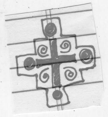
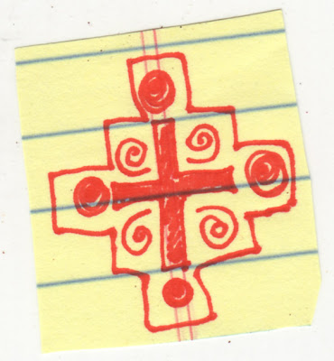
I was able to achieve the "blotted line" effect using Photoshop. My original sketch was in red Sharpie marker on a yellow lined tablet. (Does this depend on the color red to achieve the effect? I need to check that aspect out. . .)

Starting with a .jpg file I went to Image, then Mode and selected Grayscale.


And then, again under Mode, I converted the image to Bitmap (Input Resolution 72 pixels/inch; Output Resolution 1200 pixels/inch; Method use 50% threshold). The result is a .psd file which I resized to 600 pixels wide and then saved as a .gif.

Then, using the brush tool set to white, I cleaned up the background, preserving the cross design. (Note to self: straighten up the image in the first step while it is still in .jpg format because you can't do it once the image is in Bitmap!).


I need to experiment further to see what happens with different Resolution and Threshold settings.

Recently I've been noticing other blog posts related to Andy Warhol. My friend Jim at Dull Tool Dim Bulb links a coloring book published by Pittsburgh's H. J. Heinz Company to Warhol's Heinz Tomato Ketchup drawing.

And Mike over at Unremitting Failure published a great self-portrait in the style of Warhol's Marilyn Monroe portraits.

Wednesday, June 30, 2010

Andy Warhol and That Beautiful Blotted Line!


It's the end of June already. To a certain extent I feel like I'm clawing my way through limbo. I don't have any finished collages to show for it but there are new possibilities on the horizon. I've been watching an amazing documentary from Netflix: Andy Warhol from the American Masters Series. Aside from learning about the politics behind trends in art, I have finally become aware of the importance of Andy Warhol's work.

Funny thing how growing up with it I just took the work for granted and never even saw it, really, let alone realized its implications. All that marvelous repetition! Can you imagine what he would have done had he access to Photoshop?

So now I am in love with that beautiful "blotted line." I even found instruction on how it is done. The possibilities for collage are astounding to me. And I keep watching the documentary over and over (should I admit, obsessively--Andy would have liked that) because every time I do I pick up on something new.

The blog called Seven Impossible Things Before Breakfast has an interview in which children's illustrator Edwin Fotheringham elaborates on his use of the blotted line and it's digital translation via Photoshop using a "Wacom Cintiq" which Fotheringham describes as "essentially a flat panel monitor that acts as a pressure sensitive tablet, with stylus input."

Tuesday, June 8, 2010

Trompe l'Oeil


I love the genre of painting known as trompe l'oeil. (Previous posts here.) So I was happy to find this back issue of Art & Antiques featuring Roxana Barry's article titled "Plane Truths: 19th Century American Trompe l'Oeil Painting."
During the period from 1875 to 1910 there arose a school of American trompe l'oeil painters comprised of William M. Harnett, John Haberle, John F. Peto, Jefferson David Chalfant, Alexander Pope, George Cope, De Scott Evens, Victor Debreuil and a number of lesser-known artists. These men executed many works within the narrow confines of the pure trompe d'oeil style--in which objects are depicted with photographically realistic detail. These paintings are usually done in life-size scale against a shallow or flat background comprised most often of a door or wall very close to the picture plane.
One thing I never thought about before is that trompe d'oeil portrays the "implacable reality" of a masculine world including currency, guns, assorted military and sporting paraphernalia. Barry provides an interesting discussion of the evolution of the "artificial separation of the masculine and feminine worlds" which occurred during the time of the artists. She begins by quoting a passage from Patricia Hill's Turn-of-the-Century America (1977):
"In a secular society, materialistic in its outlook, shocked by the behavior of men at the financial marketplaces and worried about the influx of immigrants, idealized human beauty became fair Anglo-Saxon types." These fair Anglo-Saxon beauties became the predominant images in American Painting. Passive and seemingly passionless, they appear to lead pampered sequestered lives of private reveries; playing solitaire and having teas, as if waiting for a momentous encounter. As women were excluded from the vigorous and corrupt world of politics and finance, they were an obvious choice of symbol to represent the opposites of those worlds: passivity and purity. Women were protected from the harsh realities of life; men had to live them, and thus the society was divided.
There is a modern Trompe l'Oeil Society and you can visit their web site here. It features the work of some very talented contemporary artists of the genre including Larry Charles, Donald Clapper, Eric Conklin, Garry T. Erbe, Gerald Hodge, Michael Molnar, and Gregory West. Interesting that there are no women artists among them even today!

Innocuous Desuetude

I love the title of this post. It's meaning points to a state of disuse or inactivity, certainly appropriate given my recent absence here!

We had a town-wide yard sale over the holiday weekend. I didn't offer anything for sale, but did my bit by purchasing two boxes of old books from my neighbor up the street. Included were three volumes of an eleven-volume set of James D. Richardson's "A Compilation of the Messages and Papers of the Presidents." Published in 1910 by the Bureau of National Literature and Art, individual volumes are available for as little as $3.45 so it is not a particularly rare find.

One of the three volumes is the index, itself a very useful 834 page dictionary of political figures and events, which includes maps illustrating the extent of the United States during the administrations of the various presidents from Washington through Roosevelt. From perusing this volume I learned the marvelous phrase made popular in a speech by President Cleveland: "innocuous desuetude."

In trying to get a better handle on the phrase, I came upon an interesting article by William Safire published in the New York Times on October 4, 1987 titled On Language; The Penumbra of Desuetude. The lovely old photograph of the Smithsonian is from volume ten, the last page of which is numbered 7809!

Actually, I really like the sound of "Penumbra of Desuetude" in the Safire subtitle. It just brought to mind a great book that I read in library school, James Lipton's An Exaltation of Larks about collective nouns. A penumbra of desuetude could also be something one might find in an Edward Gorey drawing, no?